Email.
Get support for your Esendex Email products.
Subscription Form Builder
- How does it work?
- Create a Form
- Save a template
- Edit, duplicate or delete a template
- Integrate your form into your website
- Integrate your form with WordPress
- Preview Form
- View Form Code
- Edit a Form
- Archive, delete or restore a form
- Troubleshooting
How does it work?
The Esendex Form Builder consists of a signup form, a confirmation email and a confirmation page. When someone subscribes on your website, a confirmation email with a link to the confirmation page is sent to them. Once they confirm their registration, their email address (and any other information collected via the signup form) is added to your contact list.
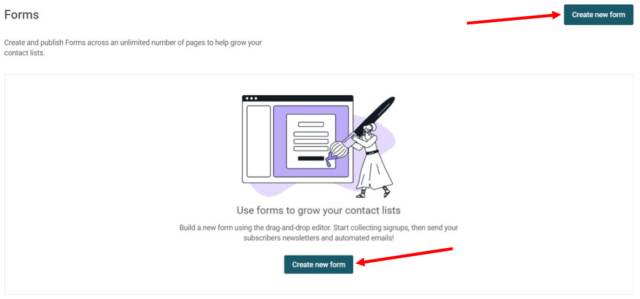
Create a form
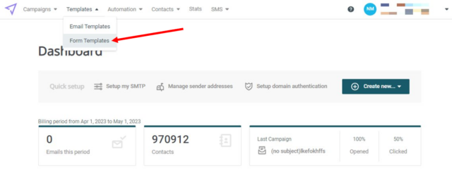
From the menu, select Contacts → Form Builder.
Now click the “Create new form” button.
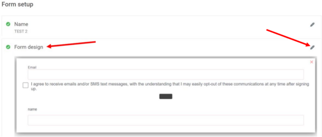
The “Create a new form” page shows the different sections of your form.
As you complete each section, the corresponding checkmark will become green.
Once all sections are completed, you can then publish your newly created inscription form.
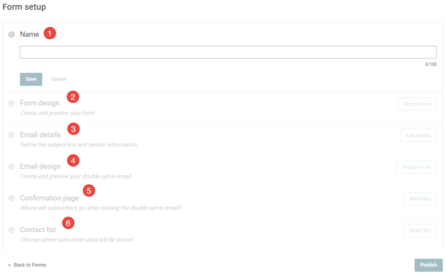
- Title: Give a title to your form to identify it in your reports. This is an internal name that only you will see.
- Form design: Create and preview your form.
- Email details: Define the subject line and sender information.
- Email design: You can customise the email (double opt-in) that is sent to new subscribers asking them to validate their subscription to your newsletter. This email will include a button with the link that redirects recipients to the confirmation page.
- Confirmation page: Once someone signs up for your form, they will receive a confirmation email with a link to validate (confirm) their registration. By default, this link leads to the Confirmation Page via Esendex which you can design in the form editor. If you wish to use your own confirmation page on your website, click “Use External Confirmation Page” and then enter the URL.
- Contact list: Choose where subscriber data will be stored.
Let’s get started – click “Design form” to select your form template.
The first step is to decide which type of form you would like to create:
Would you prefer a registration form directly embedded on your website page, or would you rather want the form to pop-up in a new window when a button or link is clicked?
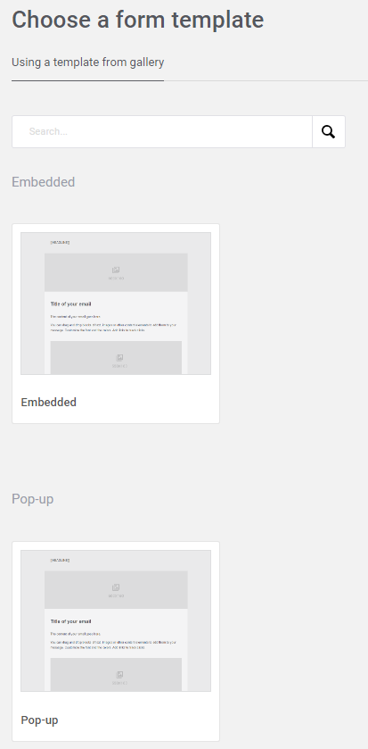
Embedded or pop-up form
Both forms are types of lead-generating forms. However, they differ in the way they are displayed.
Embedded form
The embedded form usually lives on a designated page on a website and the user must visit that exact page to subscribe to your form.
Pop-up form
The pop-up form will appear after the user clicks a button, which can be placed in multiple places on your website. Additionally, it can also appear based on predefined conditions, triggered via a hyperlink, image, or any HTML element that can launch a Javascript function (must be coded on your end), allowing you to capture leads based on their behavior patterns.
For example, you can pop up a form when a user is browsing a webpage for a while or if the user is about to leave the website.
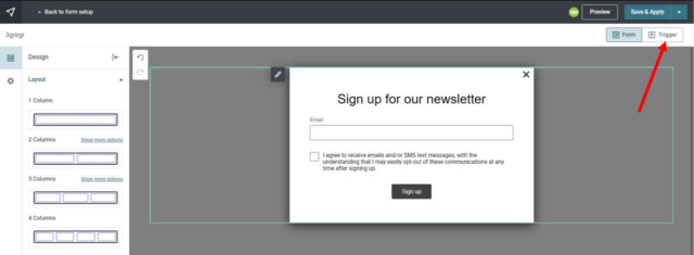
If you choose the pop-up form type, an additional button named ‘Trigger’ will appear on the form design page, giving you the option to modify the pop-up form trigger button to your liking (text, colors, etc.).
For this example, we will select the “Pop-up” form.
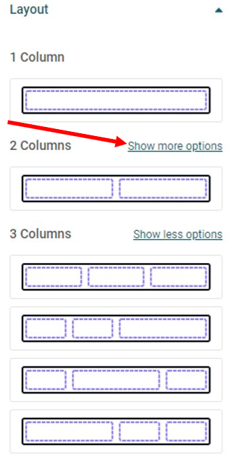
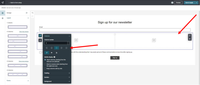
Form Layout tools
This part is the beginning of the design, where you create the structure of your form. In this step, you can add all the necessary columns which will be filed with content later.
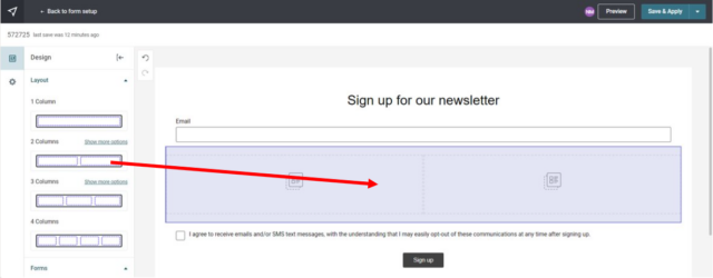
You can choose between 1 and 4 consecutive columns and play with the content blocks ratios, if necessary, by clicking on “show more options”.
The layout can of course be changed later using the toolbar if you decide to change your design.
Content Tools
This area covers all the content elements that will appear in your form (text, images, buttons, social sharing, etc).
Adding content is easy – just click on the content block and drag it to the desired area in your form. If you want to move that block, just drag and drop it to the new location.
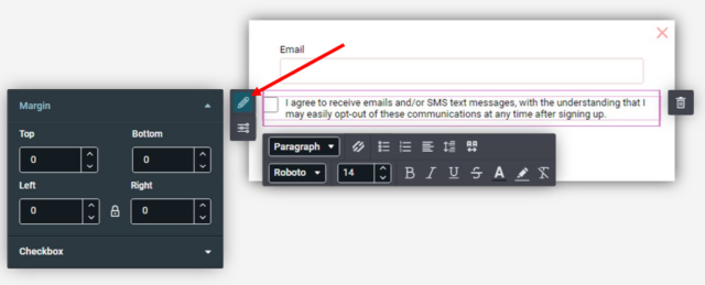
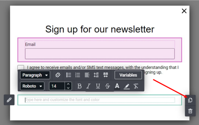
Click within the frame to customise the element using the toolbar that appears around the frame.
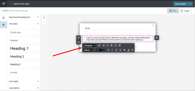
Text
Using the Text toolbar, you can easily format and customize your text block:
- Adjust line heights
- Align text
- Set the background color
- Change Margins
- Format your text (font, bold, italic, etc)
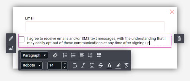
- Select the consent type (Explicit or implicit)
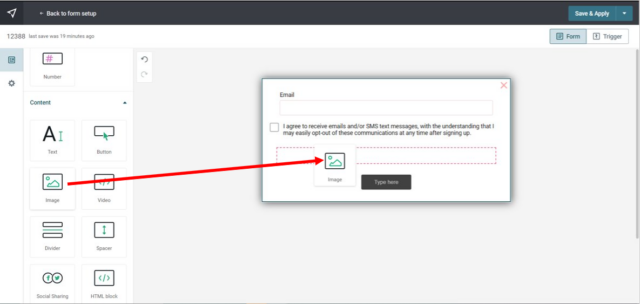
Image
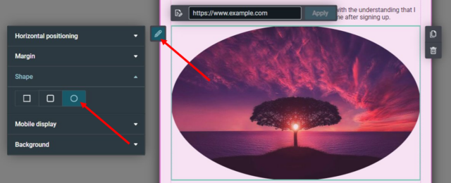
The Image toolbar allows you to:
- Set the horizontal positioning
- Change Margins
- Apply a border (shape) to the image
- Mobile scale-up
- Set the background color
You have two ways to add an image to the section:
- Upload your image or pick an image from your gallery
- Link to an existing image online
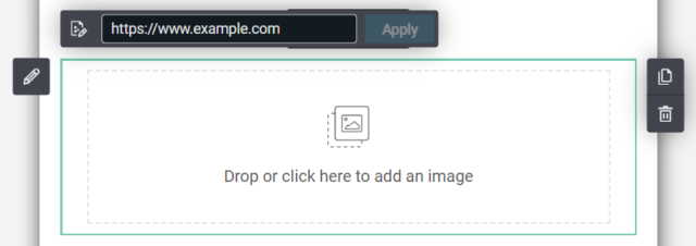
For this example, let’s upload an image.
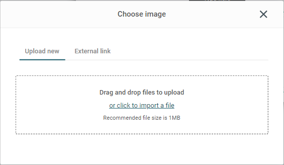
Once you click the upload image button, you can drag & drop your image file into the dialog box, or click the “import a file” link to upload your image. You also have the choice to upload an image from an external link.
You can choose to add ALT text to your image. In the event your image cannot be rendered, the ALT text will appear instead. Keep your ALT text short and descriptive, kinda like a tweet. 🙂
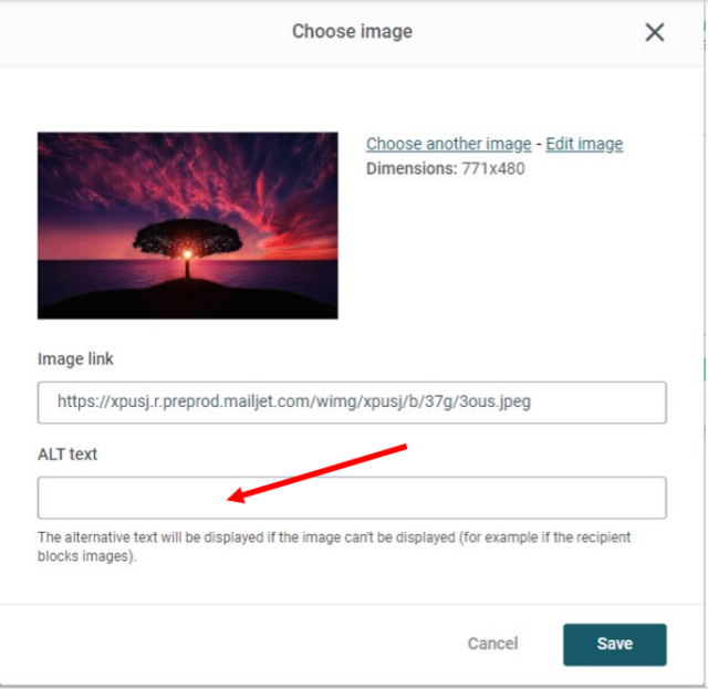
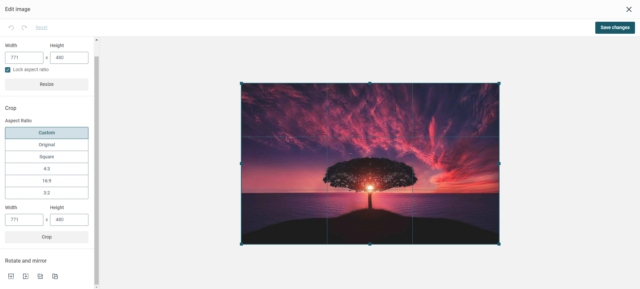
Once you have chosen an image, you can use the Image Tool Editor to crop, resize, rotate, or flip your image.
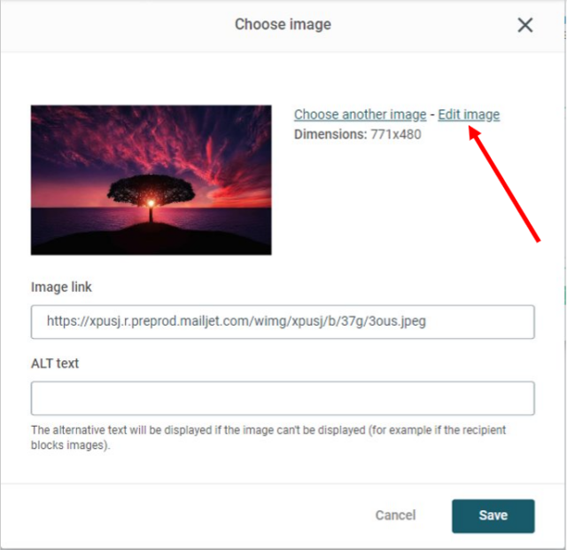
This also can be done once the image has been saved, by clicking on the image you want to modify and then on the Image Tool Editor button.
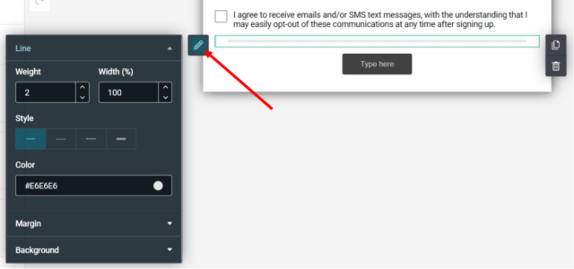
Divider
You can add a dividing line to separate sections or elements within a section.
The Divider toolbar allows you to:
- Set the background color
- Change Margins
- Format the line (design, color, weight)
- Adjust the horizontal and vertical spacing
Button
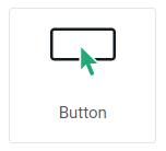
There are many options available in the Button toolbar including:
- Border Radius (set the roundness of the button corners)
- Button border color, weight, and style (solid, dotted, dashed, etc)
- Set horizontal positioning and padding
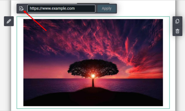
- Add a hyperlink
- Font alignment
- Adjust the margins
- Personalize the text using contact properties
- Format the font (font family, color, bold, etc).
Spacer
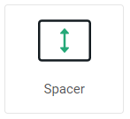
Add a blank space to separate elements or sections within your form. With the Spacer Tool, you can:
- Set the height of the blank space (in pixels)
- Add a background color (optional)
Social sharing
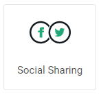
Add your favourite social icons to your form such as Facebook, Twitter, LinkedIn, Instagram, Youtube…
Click the “Configure links” button to open the Social Media Configuration modal where you can:
Select up to 10 social media icons
Modify the label text
Share the online version of your marketing newsletter to your social media account or set the link to go directly to your social media page.
Create your own social icon by clicking “Add custom icon”
To show and configure the text labels, click “Display labels“.
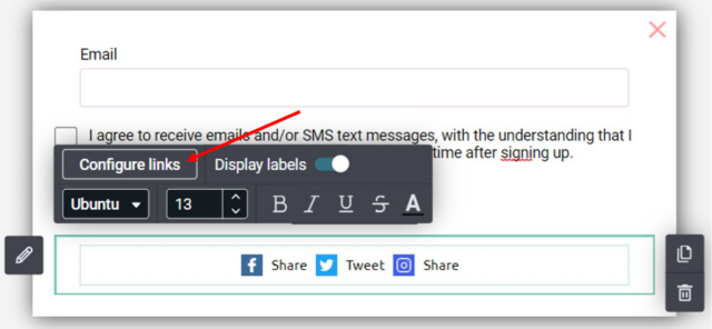
Click the block options (pencil) to configure the icon size, shapes and color as well as the section background color and padding.
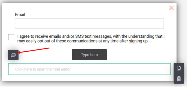
HTML Block
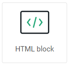
You can add some HTML code directly into your form. Drag the HTML Block to your form, then click on the button from the toolbar to open the HTML editor window and code away!
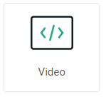
Video
To add a video to your form, drag the Video tool to the desired location. In the popup modal, add your video URL.
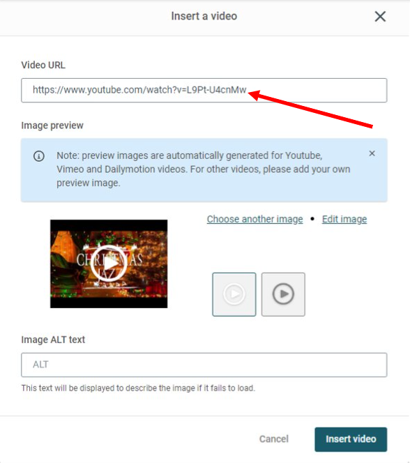
Preview images are automatically generated for YouTube, Vimeo and Dailymotion videos. For all other videos, click “Choose another image” to add your own preview image.
Once the preview thumbnail is created, the default play button will be added. You can choose from several designs for the play button. (Please note, that the play button image will be automatically resized relative to the thumbnail size. Specifically, it will be 50% of the smallest edge (width or height) of the preview thumbnail.)
The last step is to add a simple description of the preview image in the “Image Alt Text” field. This alt text will be displayed in the event your subscriber cannot view the image. Then click “Insert Video”.
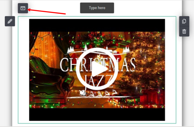
From the Video toolbar, click the “Video” button to edit your video at any time.
Forms
Collecting additional information (properties) from your subscribers is easy – just click on the form block of your choice and drag it to the desired area in your form. If you want to move that block, just drag and drop it to the new location.
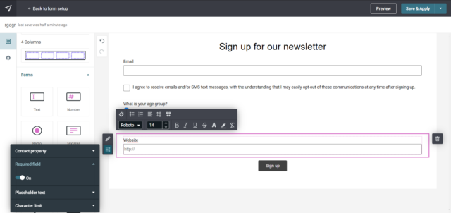
Text
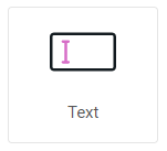
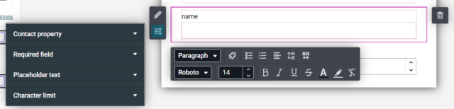
The “Text” form block allows you to add a string data property linked to the subscriber’s email. The maximum length of this field is 255 characters.
Available options:
- Set horizontal positioning and padding
- Apply a border (shape) to the image
- Set the background color or imageSelect a contact property
- Set the field as required
- Add a placeholder text (hints)
- Adjust the maximum character limit
Textarea
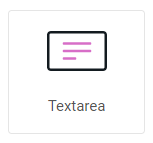
The “Textarea” form block allows you to add a string data property linked to the subscriber’s email (same as the “Text” block), but this time the maximum allowed length of the field is 500 characters.
Available options:
- Set horizontal positioning and padding
- Apply a border (shape) to the image
- Set the background color or image
- Select a contact property
- Set the field as required
- Add a placeholder text (hints)
- Adjust the maximum character limit
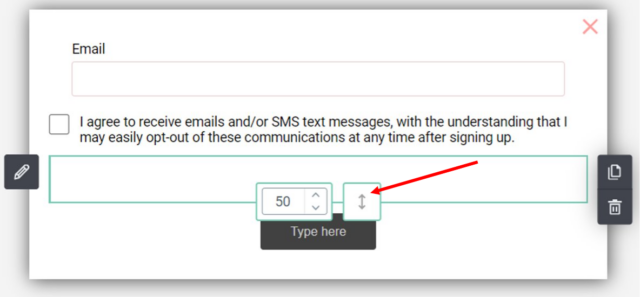
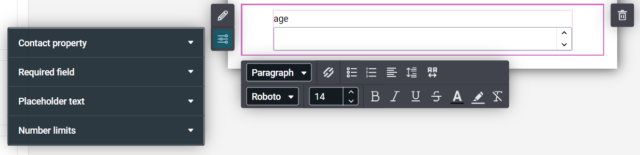
Number
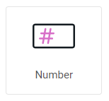
The “Number” form block allows you to add an integer or decimal data property linked to the subscriber’s email. You can add a custom range and increment limits for this field.
Available options:
- Set horizontal positioning and padding
- Apply a border (shape) to the image
- Set the background color or image
- Select a contact property
- Set the field as required
- Add a placeholder text (hints)
- Set custom range or increment limits
Radio buttons
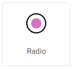
The “Radio Button” form block allows the user to choose a single option from a predefined set of mutually exclusive options. When the user selects a radio button, any previously selected radio button in the same group will be deselected.
Available options:
- Change Margins
- Format your text (font, bold, italic, etc.)
- Set background, inner and border colors of the radio buttons
- Select positioning (space between icons/text and options)Use a contact property
- Set the field as required
- Define the text for each radio button
Be aware that the text options will be different depending on the property data type you have chosen (String, Integer, Boolean etc.)
Web URL
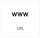
The “Web URL” form block is used to store web URLs. It is most often used to store the contact’s personal website. The form will only accept the URL if it is correctly formatted. If the format is incorrect, the field will become red, and an error will be displayed.
Available options:
- Set borders and padding
- Set the background color or image
- Set the field as required
- Add a placeholder text (hints)
- Adjust the maximum character limit
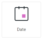
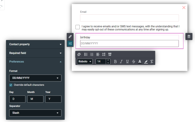
Date
The “Date” form block is used to store specific dates in a form, such as the user’s Birthday date for example. The input mask is automatically added to the field, showing the user the correct date input order, which you can manage from the preferences panel.
Available options:
- Set borders and padding
- Set the background color or image
- Use a contact property
- Set the field as required
- Date format preferences
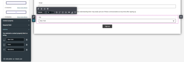
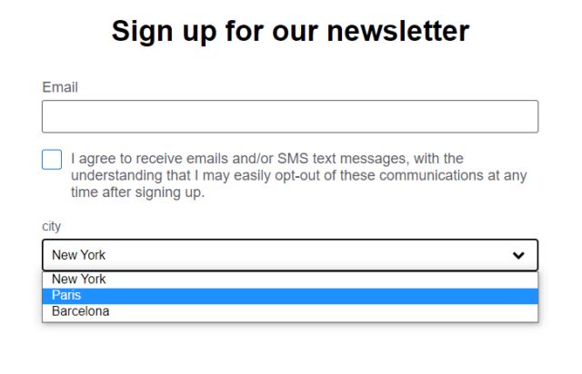
Dropdown
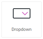
The “Dropdown” form block allows the user to choose a single option from a dropdown menu with predefined options, similar to the “Button” block. When the user selects an option from the dropdown menu, any previously selected option will be deselected.
Using a dropdown menu in a subscription form can make the form more user-friendly by reducing the amount of typing required and providing a clear set of options for the user to choose from. Additionally, it can help ensure that users provide accurate and consistent information, which can be important for managing subscriptions.
Available options:
- Set borders and padding
- Format your text (font, bold, italic, etc.)
- Arrow icon colors
- Set the background color or image
- Use a contact property
- Set the field as required
- Define the text for each option
Sections
Duplicate a Section
Click within the section to highlight it, then click the duplicate icon on the right side of the screen.
Delete a Section
To remove a section from your form body, click within the section, then click the trash icon and confirm the deletion.
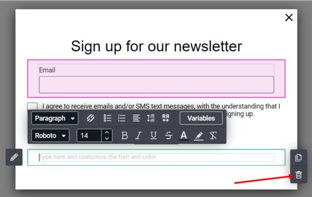
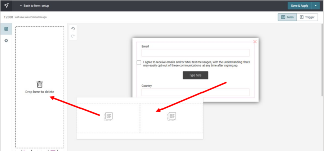
You can also quickly delete a section or element, by dragging it to the content tools area.
Global style settings
With a couple of clicks, easily format the text styles of all your paragraphs, headers and hyperlinks within your form.
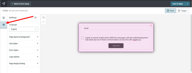
To access the global text styles, click on the gear icon in the upper left corner (“Settings” tab).
As the name suggests, the “Global Style” option will set the font family and color for all the elements listed (Headers, Paragraphs, Links).
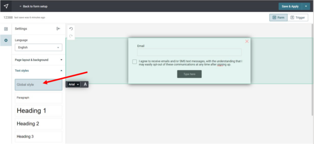
You can then further customise the styling for each of the Headers, Paragraph and Link elements.
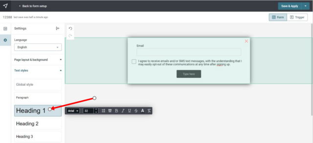
And lastly, if you want to have a different text style for a certain header or paragraph in your form, simply style the text as usual with the section toolbar.
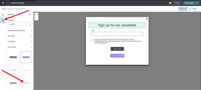
Logo options
When using our Form builder, a ‘Powered by Esendex’ logo will be added to the footer.
You can choose between 5 different logo color schemes from the ‘Logo Options’ section of the ‘Settings’ tab. Note that the logo is not movable or resizable.
If you are on a Paid Plan, the logo can be removed by selecting the ‘No Logo’ option. However, if you are on a free plan, you will be prompted to update your subscription when you click on the “No Logo” option.
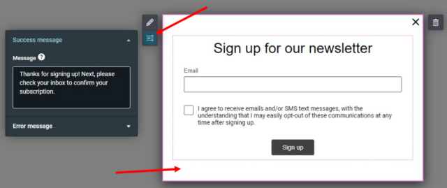
Success and Error messages modification
Users see these messages when they submit the form successfully or there is an error. They still have to click on the double opt-in email to sign up.
These messages are automatically generated for you, so don’t worry. However, if you want to display your own success and error messages, you can.
Click inside the form frame to display the toolbar and select the slider buttons icon. You will then have the possibility of modifying the two messages to your liking.
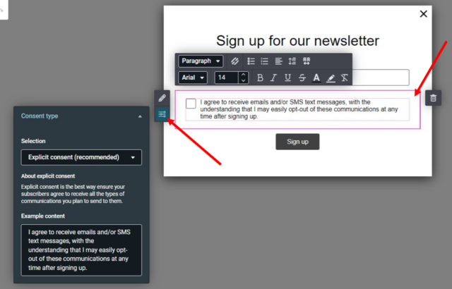
Consent types and text modification
You can choose between two types of consent, explicit and implicit. Click inside the consent text frame to display the toolbar and select the slider buttons icon. Select the type of consent you want to use and edit the text to your liking if necessary.
Explicit Consent (Recommended)
Explicit consent is when an individual is presented with a decision on whether they authorize the collection of their personal information before data is collected. This is the best way to ensure subscribers agree to receive your communications.
Implicit Consent
Implicit consent doesn’t require subscribers to “check the box”. This type of consent means that by submitting the form, subscribers agree to receive communications you plan to send to them.
Save a template
Creating a template allows you to save time and effort in the future. By creating a template of your work, you can easily reuse it for similar projects without having to start from scratch every time.
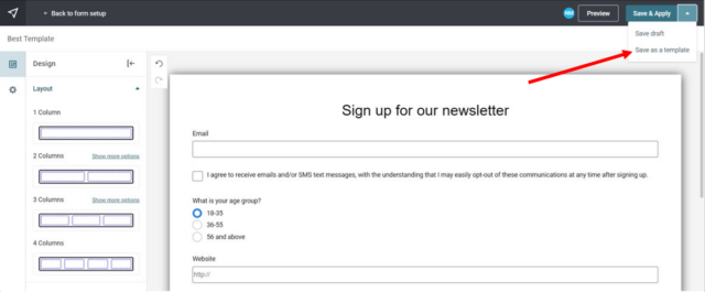
When designing your form, you can choose to save it as a new template or replace an existing template. From the form builder design page, simply click on the drop-down menu at the top right and select “Save as Template”.
Overall, saving your work as a template can save you time and effort in the long run, while also ensuring consistency, standardization, and collaboration across projects.
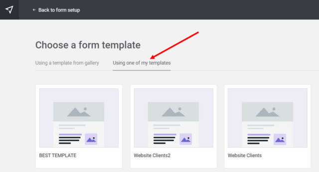
To access your saved templates when creating a form, click the “Design a form” button, then choose one of your own templates.
Edit, duplicate or delete a template
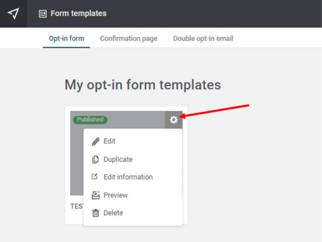
To edit, duplicate, or delete a form template, navigate to the form template management page and click the gear icon.
You will then be presented with several options that you can choose from. Select the action of your choice and voila.
Note: Please exercise caution when deleting form templates, as the action is permanent and cannot be undone.
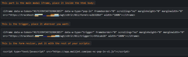
Integrate your form into your website
The last step is to integrate the subscription form HTML code – just copy and paste the code into your website!
Here is a breakdown of the code that will help you with its integration on your site.
Integrate your form with WordPress
You can add the Subscription Form code directly into a post, page or add it via a WordPress Widget.
For this first example, we will create a new page and add the Subscription form.
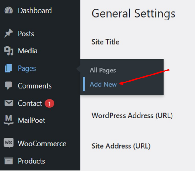
From the menu, select Pages → Add New
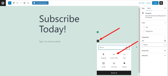
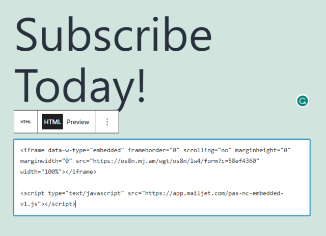
Enter the page title, select the “Custom HTML” block, and paste the Subscription Form code (from your Esendex account).
Click ‘Publish‘ and you are done – your subscription widget will appear on the new page.
Your Subscription Form can also be added to your website via the WordPress Widgets.
From the main menu, go to Appearance → Widgets
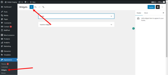
On the Widgets page, you will see all your widgets. To add a new widget (Form), click on the “+” icon in the upper left corner and drag the “Custom HTML” block from the widget’s menu.
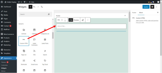
Paste the Subscription Form code (from your Esendex account) into the ‘Content’ section. Then click ‘Update’.
And that’s it – just pop over to your website to view your subscription widget!
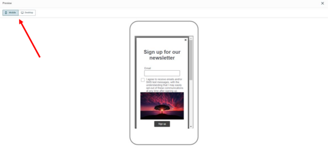
Preview Form
To preview your subscription form, go to the “Form design” section and click on the pencil icon (edit).
Once you are on the form design page, click the “Preview” button in the upper right corner of the screen.
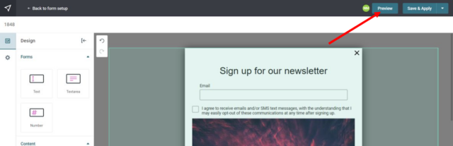
Your form can be previewed on different devices, such as mobile and desktop.
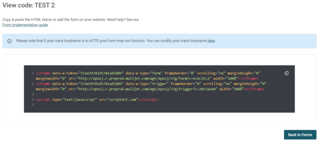
View Form Code
From the forms management page, click on the gear icon of the form whose code you want to view and select “View Code”.
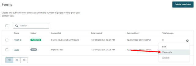
Here is a breakdown of the code that will help you with its integration on your site.

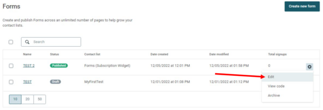
Edit a Form
From the forms management page, click the gear icon and select “Edit”.
Please note that after each modification made to the subscription form, you will have to reload the HTML code on your website, so that the modifications can be taken into account.
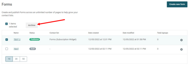
Archive, delete or restore a form
To archive a single form, click the gear icon from the forms management page, and select “Archive”.
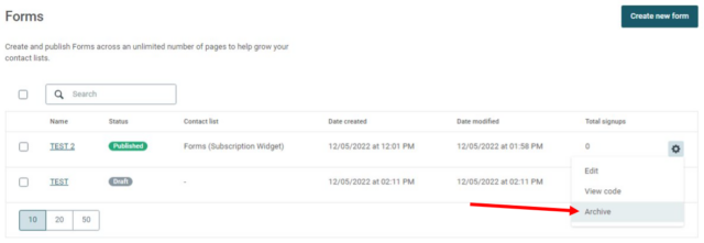
To archive several forms at the same time, check the box for each form then click on the “Archive” button.
If you wish to delete permanently a form that has already been archived, go to the “Archived” section of the forms management page, click on the gear icon, and select “Delete”.
Always exercise caution when deleting forms or any other data in your Esendex account, as deleted data cannot be recovered.
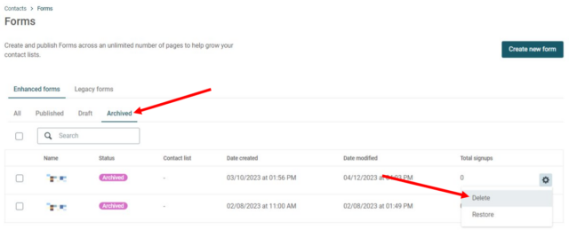
If you have archived a form and wish to restore it, you can do so from the gear icon by selecting “Restore”.
Troubleshooting
If you have implemented a subscription form on your website, and it has suddenly stopped working, please check that the contact list associated with the form has not been changed or deleted.
Recommended articles
Can't find what you're looking for?
Speak to a member of our support team.