Email.
Get support for your Esendex Email products.
Campaign Comparison
Introduction
Trends move quickly these days and with that consumer behaviour as well. Are your email campaigns keeping up? With Campaign Comparison, you’ll always be able to find the most appealing content to engage your customer’s ever-changing tastes.
Our results page is packed with visual and quantitative data -everything you need to analyse and continuously optimize your campaigns.
How to Access Campaign Comparison
You can access the Campaign Comparison feature in a few ways:
From the menu: Campaigns → Compare Campaigns
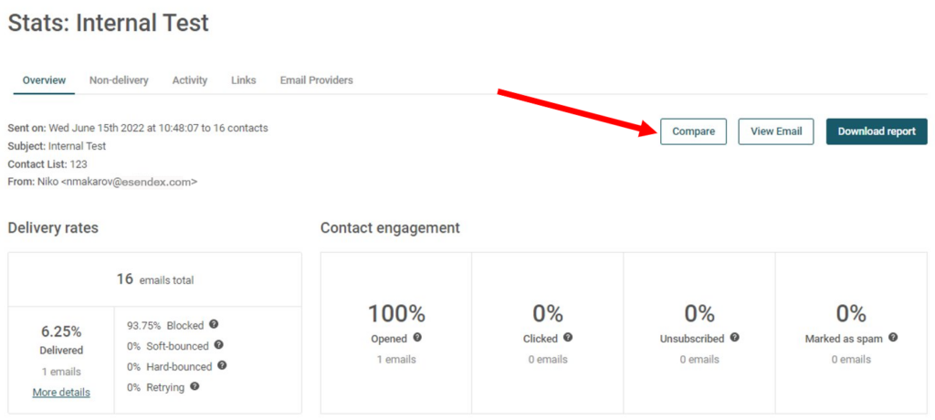
And from the ‘Overview’ tab of your Campaign Statistics.

Using Campaign Comparison
On the Campaign Comparison page, select up to 10 campaigns to compare simultaneously. Then click ‘Compare campaigns‘.
Campaign Comparison Results
The results are displayed in a graph and summary chart format to easily let you determine what part of your campaigns your customers responded positively to.
You can view the results in a few different formats on the graph. If you place your mouse at any point on the graph, a popup will appear showing the elapsed time at that point and KPIs for each campaign.
The graph results are updated for 7 days from when the first email was sent. After the 7 days, the results are no longer updated in the graph.
The data in the table shows the lifetime results for each metric of each campaign and is continuously updated. Both the percentage and actual figures are displayed for each metric, and you can sort by campaign name, date, or metric, by simply clicking the ‘arrows’ at the top of each respective column.
To view the full statistics for a campaign, simply click on the campaign name from the table.
And that’s a wrap! You are now ready to compare and optimize your email campaigns – and on your way to higher opens and clicks.
Happy Comparing!
Recommended articles
Can't find what you're looking for?
Speak to a member of our support team.